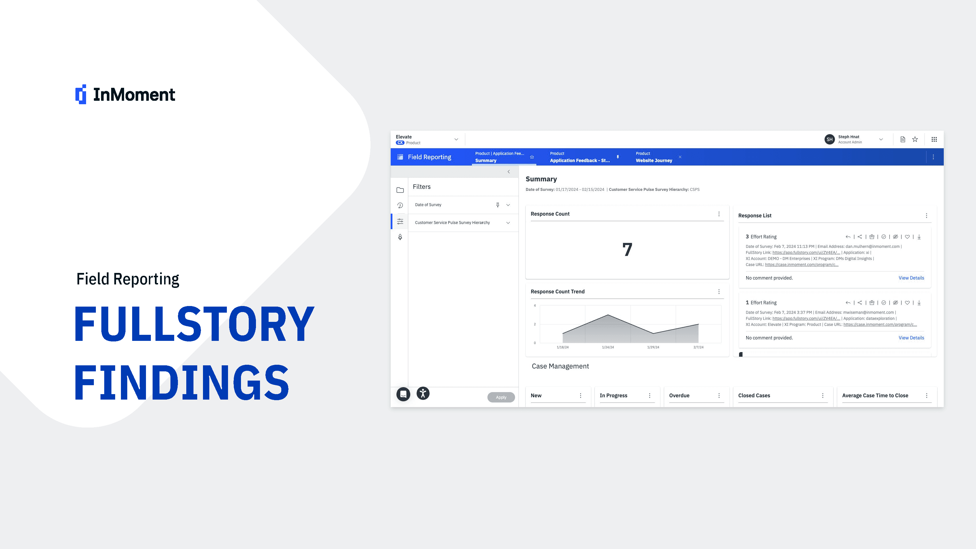
SAAS Survey data platform
Survey Data Dashboard


InMoment's Field Reporting platform serves as our client's primary tool for day-to-day operations. As their analytics solution faced growing adoption, we needed to gain deeper understanding of user behavior to guide future development. Our team embarked on a three-week design process to analyze platform usage patterns and identify opportunities for improvement.
The project required close collaboration with development teams, product managers, and other design teams to ensure our insights would translate into actionable improvements while maintaining a seamless experience across the platform. Our biggest challenge was determining how to effectively visualize data that would connect well with other parts of our platform.
Timeline
7 weeks (while managing multiple concurrent projects)
User Research
I conducted 12 stakeholder interviews with internal experts and 8 client interviews to understand pain points with the existing "Campaign Insights" feature. Key findings included:
Difficulty accessing critical survey response data
Inconsistent visualization between platforms
Limited filtering capabilities
Inability to export or share insights easily

Requirement Gathering
I facilitated 3 collaborative workshops with the product, development, and customer success teams to:
Document technical constraints and opportunities
Map user journeys for different personas (executives, managers, and analysts)
Prioritize features based on user needs and technical feasibility
Create a comprehensive requirements document with user stories
Competitive Analysis
I analyzed 5 competitor products and created a feature comparison matrix to identify opportunities for differentiation and innovation.
Testing & Optimization
Met with InMoment internal experts to hear concerns and validate what was talked about in the hand-off meeting. Using FullStory and help from our dev teams, we found insights in the platform's interaction data. After merging this with data from the internal interviews, we reviewed sessions from our top client's custom dashboards.
We needed to think pretty far ahead to have a clear idea of what steps needed to happen first. This involved a lot of back and forth with dev teams, product and other design teams. Our biggest hurdle was to overcome intended data visualizations and if it would connect well with other parts of our platform for a seamless experience.

Low-Fidelity Exploration
Created paper sketches exploring 4 different information architecture approaches to address navigation confusion.
Developed wireframes for improved mobile responsiveness and the FR-DX connection experience.
Conducted informal testing with 5 internal stakeholders to validate our initial concepts for addressing the identified bugs
Mid-Fidelity Prototyping
Evolved wireframes into interactive prototypes incorporating feedback from power users
Created multiple visualization options for dashboard data to reduce reliance on page refreshing
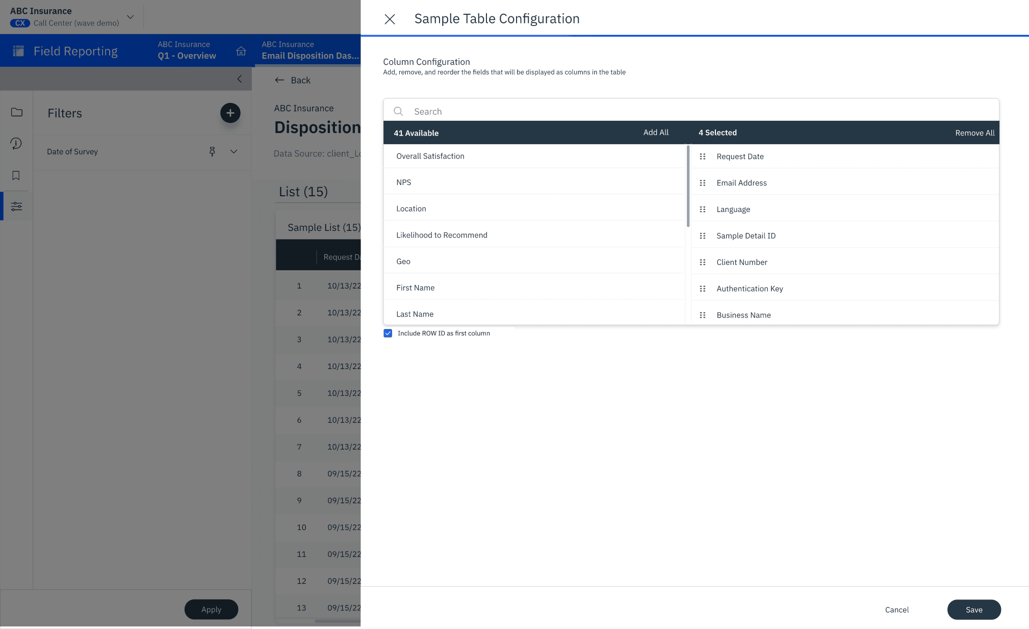
Tested with 3 client representatives to validate usability improvements, particularly focusing on the "View Details" modal and tooltip functionality
High-Fidelity Design
Developed comprehensive UI components following InMoment's design system, ensuring proper spacing and headers in modals
Created detailed specifications for interactive elements, including improved tooltip behavior
Designed responsive layouts for various screen sizes to address mobile version issues
Produced a clickable prototype demonstrating the seamless connection between FR and DX experiences
Presented the final solution to 3 key clients for feedback
Created training materials and onboarding documentation with PMs and Customer Service Representatives
Developed a phased rollout plan with the product team
Established metrics for measuring success post-launch through fullstory


Feature Usage Analysis
Our investigation into commonly used features revealed several critical insights:
The most interacted widget was consistently the detail report feature
Power users heavily relied on the FR (Field Reporting) experience
Mobile responsiveness issues were identified as numerous users reported the mobile version appearing broken
Users preferred a direct link between FR and DX experiences rather than using the quick action button
Widget interactions showed that while users frequently accessed the main dashboard, the path to DX experiences through widgets received significantly less engagement compared to navigation via detail list buttons.
User Adoption & Growth
The Field Reporting application demonstrated remarkable growth:
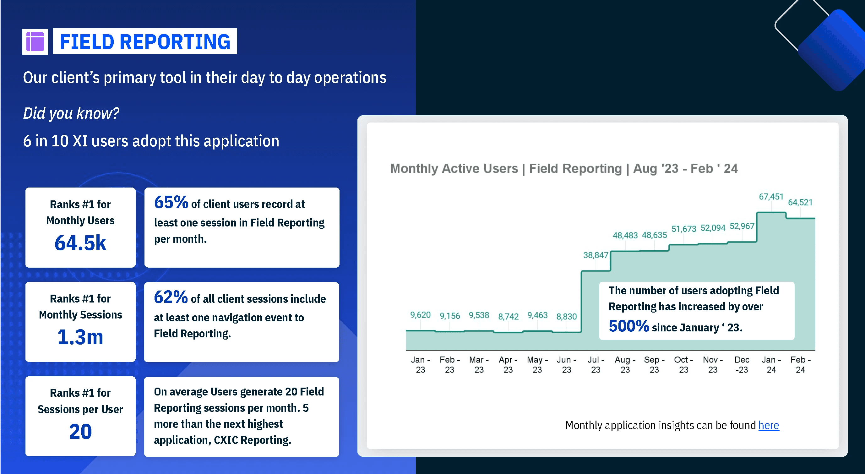
Monthly active users reached 64.5k, making it the #1 ranked product by user count
Total monthly sessions topped 1.3 million
Users generated an average of 20 Field Reporting sessions per month (5 more than the next highest application, CXIC Reporting)
User adoption increased by over 500% since January 2023
65% of client users record at least one Field Reporting session monthly
62% of all client sessions include at least one navigation event to Field Reporting
Platform Comparison & Performance Issues
When comparing the legacy CXIC platform with the new XI platform:
XI Sessions significantly outpaced CXIC (691,816 vs 49,713 in Feb-March)
Field Reporting (pink line) showed consistent growth over the past 12 months while CXIC Reporting (blue line) remained relatively flat
Dashboard performance analysis revealed:
Certain companies and roles were refreshing dashboards more frequently than others
By filtering refresh events by account, URL, and role, we identified performance issues in the loading process
Some inspect interactions took noticeably longer to load than others
Power User Analysis
Examining our most active users provided valuable bug detection and usability insights:
Top users were refreshing reports multiple times per session (up to 6 times), suggesting they were waiting for updated data
UI bugs were identified, including missing headers and padding in the "View Details" modal
Tooltips weren't properly closing when users scrolled away from widgets
Users showed confusion about report navigation, often closing home reports and finding blank FR pages
Intelligent Filtering
AI algorithms analyze user preferences, tags, and snippets of feedback to generate optimized data sets. Users can:
Filter by response status, date ranges, and custom parameters
Save and share filter configurations
Set up automated alerts for specific data patterns
Customized Dashboard Widgets
Flexible visualization options aligned with company preferences
Drag-and-drop dashboard customization
Role-based widget recommendations
Ability to add, remove, and resize widgets as needs change
Drill-Through Data Exploration
Intuitive drill-down into sample data sets
Customizable drill-through preferences and priorities
Seamless switching between summary and detailed views
Export capabilities for further analysis

Measurable Outcomes

Increased Efficiency
43% reduction in time spent analyzing survey data

Improved Data Visibility
72% of users reported better insight discovery


Internal Impact
Solution became a reference design for other platform integrations, design patterns were incorporated into the company design system, and methodology was adopted for future feature migrations.
Positive User Feedback
High user satisfaction ratings and positive reviews highlight the app's intuitive interface and powerful AI capabilities.
This project reinforced the importance of cross-functional collaboration and early user involvement. By bringing together product, design, and development teams from the beginning, we were able to create a solution that balanced user needs with technical constraints while meeting business objectives.
Our biggest challenge was reconciling legacy data structures with new visualization capabilities, which required close collaboration with data engineers and frontend developers to ensure performance and accuracy.